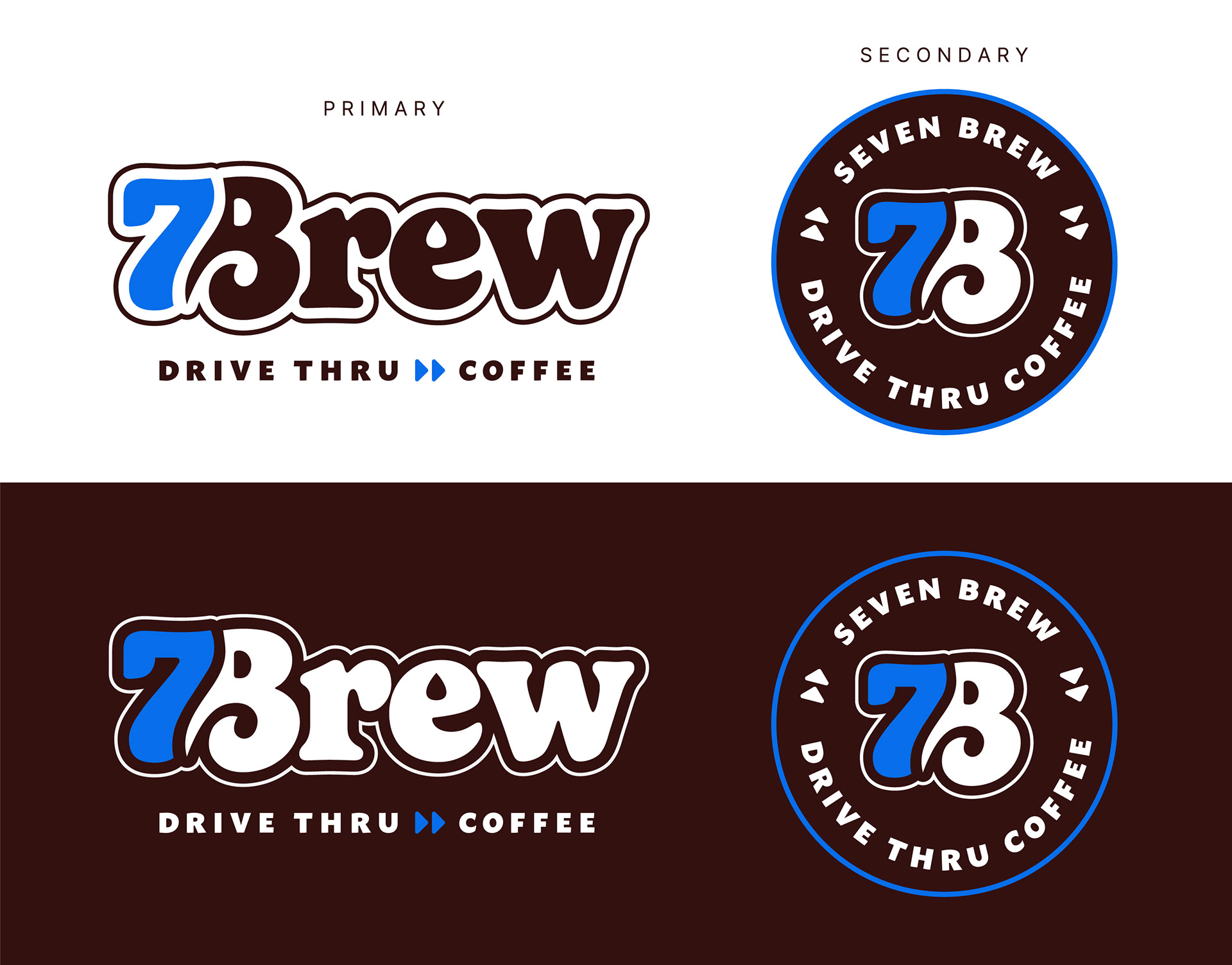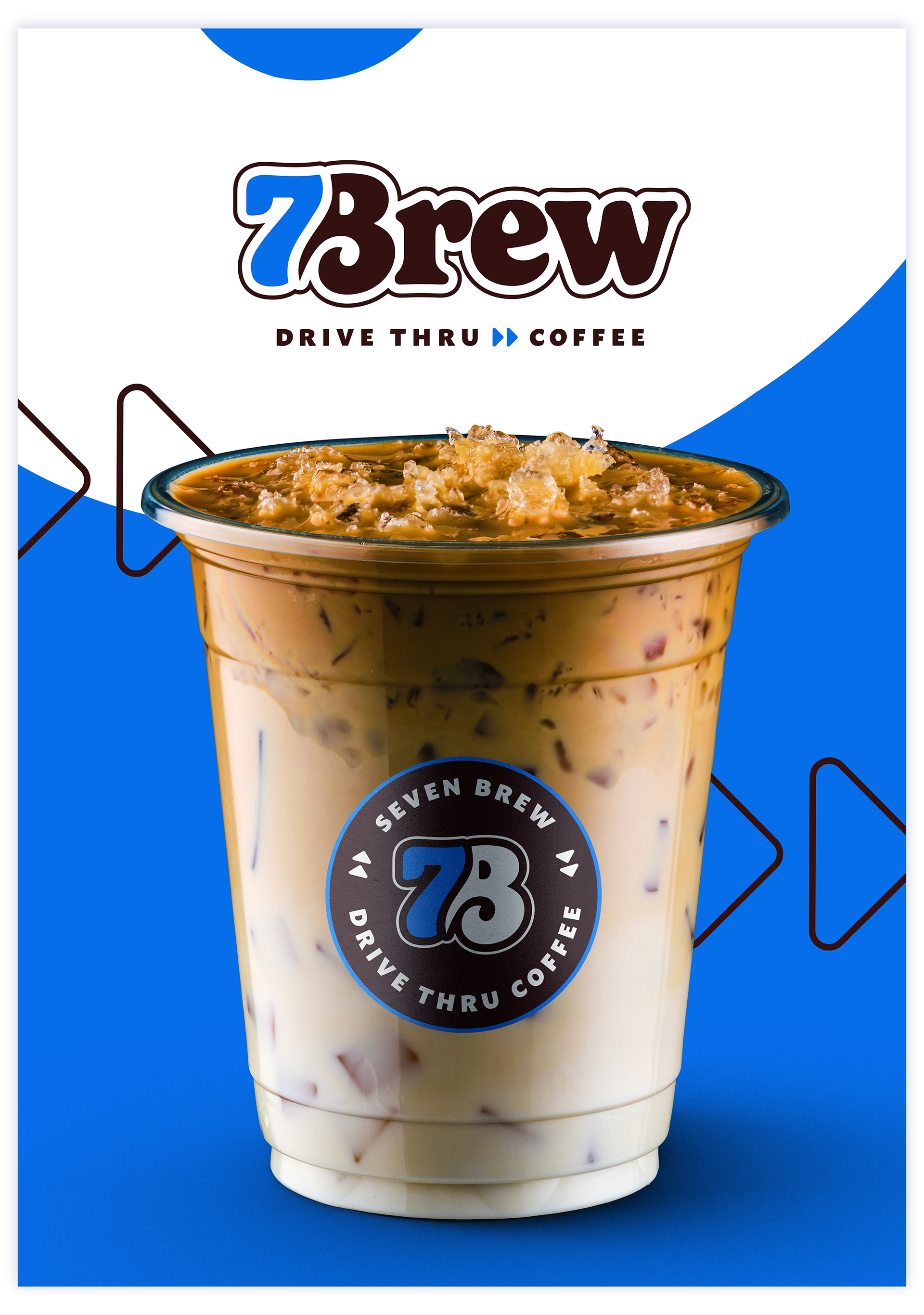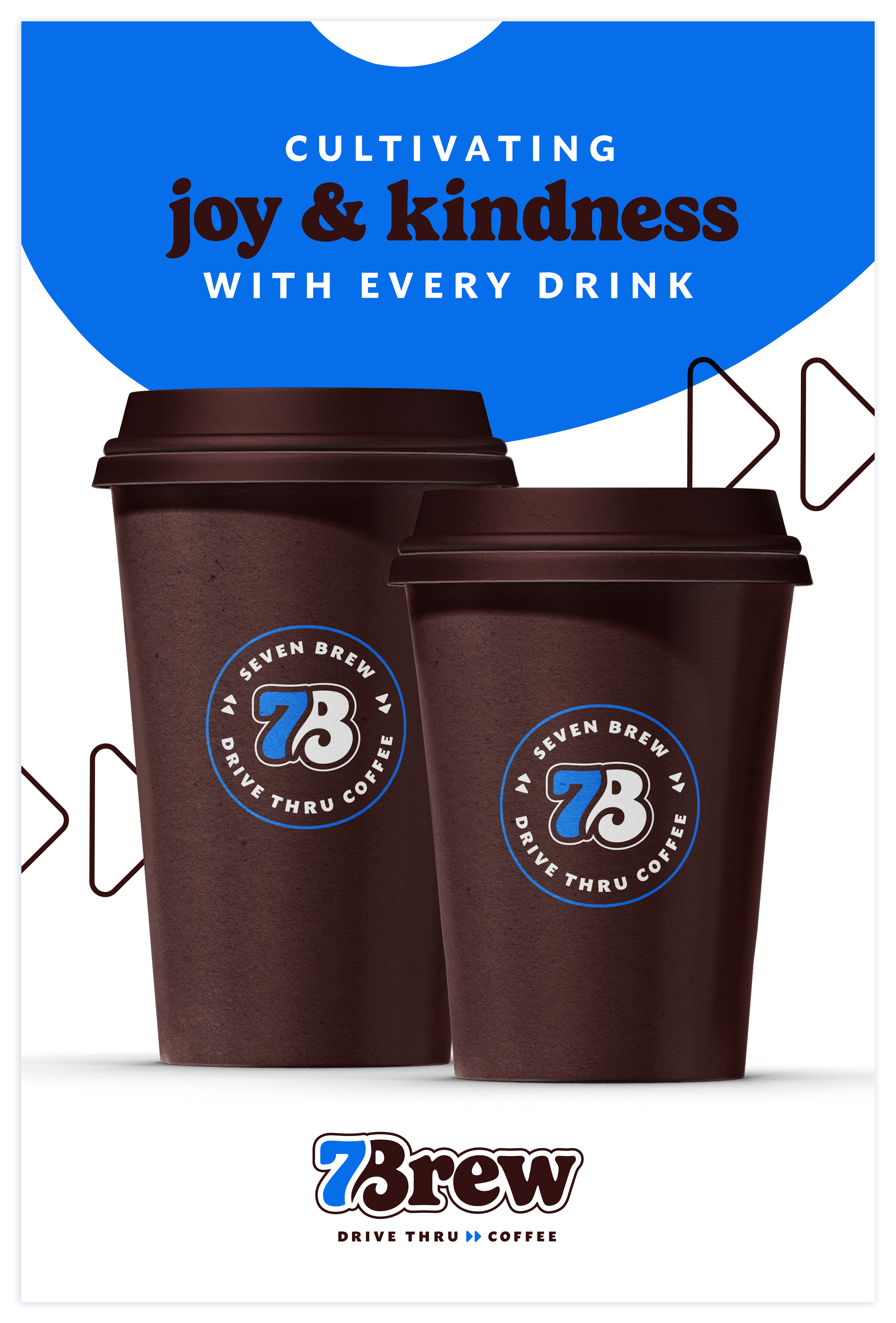
Scope: A conceptual logo and identity refresh for 7 Brew Coffee, focusing on streamlining core visual elements, introducing a warmer typographic system (Gelica Black), and shifting the color palette to an energetic blue.
Tools: Illustrator, Photoshop
Year: 2025
Outcome: Created a more cohesive, upbeat, and approachable brand presence that establishes a stronger visual connection to 7 Brew's physical locations